Now that you have contributed so much of your time and money to your shiny new WordPress website and have showcased your talents to the world, it is important to ask the questions; “Did you pay close attention to perfecting the WordPress user experience?”
Today’s tech-literate consumers have high expectations, which is why a website that feels clunky and awkward, just isn’t good enough. Providing the best user experience for your WordPress site should be paramount. No matter how professional or high quality your products or services are, if your site showcase doesn’t give a high standard of customer user experience, you will be doomed to failure.
In this blog, we have put together a guide on how to greatly improve user experience in your WordPress site with 7 strategies to succeed.
Why is the user experience so important?
In a world filled with so many digital options and distractions, providing a good user experience can be one of the main keys to success. Take Uber for example. Uber revolutionized the taxi industry with a new way to order and track cabs by using an intuitive and simple-to-use app on your mobile phone. Uber is now a world-wide multibillion-dollar company with services in most cities – largely thanks to its innovation and consideration of the end-user.
The same theory applies when creating your WordPress site. Whether it’s a blog, an online store, a marketing hub, or a portfolio for your services; your chances of success are intrinsically tied to the positive level of user experience you provide.
Here are some of the most obvious and measurable benefits of a good user experience:
Set a good first impression of your brand
Setting a good first impression is important for showing potential customers you’re the real deal. It doesn’t matter how good your products, services, or content are, if your WordPress website isn’t aesthetically coherent and functional, no one will want to use it. Users must be able to navigate your pages with ease so that they get an immediate sense of direction and understanding on how your site operates.
Increased sales
Any website that makes the purchasing process straightforward and easy to follow iis more likely to see an increase in sales and revenue. To put it simply, the easier it is to browse and take action, the quicker users will be able to act on impulse and purchase products and services from you. Simple features like search filters and recommendations can enhance the user experience by giving them multiple options to begin the buying journey.
It’s a win-win. A positive experience for the customer and more sales for your business.
Increase user retention rates
Offering the best user experience keeps customers coming back for more. Satisfied customers will not feel the need to look elsewhere if you’re meeting their expectations. Existing customers are also likely to recommend your site to others and become brand advocates if you offer a professional and friendly UX.
Improve search engine optimization (SEO)
Take a look at the top-ranked sites on a search engine like Google and you’ll find they all have a professional high end user experience design. The days of cramming as many keywords as possible into your content to rank via SEO are long gone. Google has expanded how it ranks websites and how it views SEO requirements by including such elements as UX design. It is important to remember this when it comes to setting and designing your site using WordPress.
How to improve user experience in your WordPress site: 7 strategies to succeed
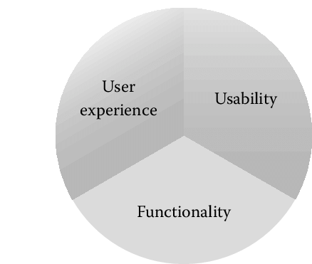
Creating a popular and (potentially) profitable website means putting the user experience first. Try putting yourself in the shoes of a new customer, and design your site around their experience, rather than how ‘amazing’ your product is. The user experience goes hand-in-hand with usability and functionality.
Let’s now look at 7 actionable strategies to help improve the user experience of your WordPress site.
1. Opt for a simple design
It is important to remember that sometimes less, really is more. Don’t sacrifice functionality for an overly pretty and complex design. Ask yourself, ‘Would I find this website easy to follow if I came here for the first time?’ Users value usability and useful features over crowded visuals. For example, always put buttons where you would expect to find a button. Make your potential customers’ life as easy as possible, as they will quickly abandon your site if they struggle to perform a simple task or have to go looking for the ‘buy button’.
A conventional blog format is suitable in many instances, that is, a header, followed by the main body and a sidebar, completed with a footer. From here, you can make subtle tweaks to enhance the overall design. Be sure to give it a quick mobile friendly test to ensure it’s appearing correctly on mobile devices.
It’s all about getting that balance between form and function.
2. Ensure navigation is easy
Navigating through your WordPress website should feel natural and effortless for the user. Try to build your site to incorporate the following features:
- A navigation bar (this is a must-have)
Naming key pages for your navigation bar is simple with WordPress. Simply click (Appearance > Menus) in your sidebar to customize your menu’s order and page names.
- A list of categories in your sidebar
Having an easily viewable list of categories will allow users to quickly navigate to their general area of interest. For example, if they are in the market for a new TV, they can browse all TVs available on your site, without having to also view Laptops.
- A search tool
Imagine a customer has come to you specifically for a bluetooth headset, give them a search bar to find them fast. WordPress has several search bar plugins for you to try. Some are free while others are paid for.
- An archives page
For an Archive page, let users search previous content by date, category, and keyword. This will help users find content fast while also helping your WordPress SEO strategy
- Breadcrumbs
Breadcrumbs are the navigational links found at the top of a page to tell you where you are on the site. For example, (Home > Blog > January 2022 > How to nail your WordPress website.)
Utilizing these common design features on your WordPress page is a great way to create a familiar experience for users.
3. Make sure your homepage is useful and informative
Your homepage is almost certainly going to be the most viewed page on your website. Think of it as your personal shop window for what goods and services you have to offer. Feature boxes can be a useful addition to the homepage. A feature box pops up on the homepage and can include content of your choice. A popular strategy is to use an ‘Opt-in’ box to introduce yourselves and encourage users to sign up for deals, information and discounts.
For example, your feature box could say:
‘Want to know the best magicjack competitors?
Sign-up now to receive advice on:
- The best in VoIP call center solutions.
- The best alternatives out there for your favorite tools.
- The best tools for collecting and analyzing key data…’, etc.
A well-placed feature box involves the visitor right away and tells them what to expect and how to get more from your site. This can add to a better user experience. However, it is important to make sure your feature box contains legitimate and valuable information and doesn’t just present as an ad attempting to get the visitors email address.
4. Is your content easy-on-the-eye?
Content that looks visually appealing is more likely to attract visitors and keep them engaged. Remember to take inspiration and design cues from other popular websites in your niche area to get an idea of how their visual layout enhances the user experience.
When designing your site, also be sure to pay attention to design elements, typography choices and formatting. Have a look at other popular websites to see what they look like and what choices they made. Once you’ve found inspiration, you can use a pre-existing layout template to start from, or design your own layout from scratch.
In terms of formatting, consider the following:
- Keep sentences and paragraphs short and sweet.
- Use sub-headers to break sections up and make navigation easier.
- Use bold to highlight keywords and phrases.
- Italics are useful for emphasis and speech.
- Images are useful for adding variety and color to a piece.
- Other visual elements such as tables, lists and quotes help break up the site and provide extra information.
Creating a good user experience means nailing a design that’s easy-on-the-eye, while also being practical.
5. Deliver fast page speeds

Today’s website users expect fast page speeds and sites that load in a second or two at most. In fact, having a slow loading site is the top reason visitors will leave.
Ways to increase page speed include:
- Using only necessary plugins
Running multiple plugins is one of the leading sources of slowing your site down. - Watch your image sizes
Image compression plugins like WP-Optimize reduce the file size of images to boost loading speeds. - Use a Content Delivery Network service (CDN)
This adds a level of protection against WordPress security issues too. - Enable caching
Saves user data to reduce future loading times. WP-Optimize is also one of the leading caching plugins available for WordPress
6. Include plenty of negative space
Also known as white space, negative space refers to the parts of your page that have no content.
Somewhat ironically, negative space usually leads to a positive experience. Utilizing negative space lets users focus on the important aspects of your content without being distracted. 84.6% of web designers believe crowded web design is the most common mistake by small businesses.
Today’s consumers visit dozens of web pages a day. It’s likely they’re going to scan through your website anyway. A clever use of negative space lets them do this at their leisure without becoming bored.
7. Have a clear call-to-action
What use is your website if you don’t tell users what to do next? Far too often, visitors will leave a website without taking action simply because there was no clear CTA. A well-placed and well-worded CTA is key for boosting your WordPress conversion rates. Modern users want fast results, so placing your call-to-action button immediately after or halfway through your written content is a good way to go.
Effectively, you want to make it easy for the user to take the desired action without them having to search around for what’s next. WordPress has some useful plugins for managing CTA’s, have a look and see what works for you.
Final thoughts
Now that you have reviewed all the potential ways you can help improve the user experience for your WordPress site, these tips have got you thinking about the ways you can employ them to help boost your performance and SEO score.
The strategies above are commonly used across successful business websites all over the world on both WordPress and non-WordPress sites. Failing to have your own strategy could see you fall behind the rest and struggle to gain a foothold in your particular niche.
Start building your next WordPress website today, and remember to keep the user experience in mind in everything that you do.
Jessica Day – Senior Director, Marketing Strategy, Dialpad
The post Improve your WordPress user experience: 7 strategies to succeed appeared first on UpdraftPlus. UpdraftPlus – Backup, restore and migration plugin for WordPress.